About CareerBud.net
CareerBud.net was created by engineers working in close
collaboration with plant managers inside a UK-based power
generation plant — not as a theoretical product, but as a daily
operational tool shaped by real-world demands from both the people
doing the work and the people overseeing it.
Over more than two years of continuous real-world use, the system
was developed under real production pressure, solving practical
problems in maintenance control, task management, asset lifecycle
tracking, spare-parts inventory, and operational efficiency. Every
feature was tested and refined in live industrial conditions with
direct feedback from the teams using it every day.
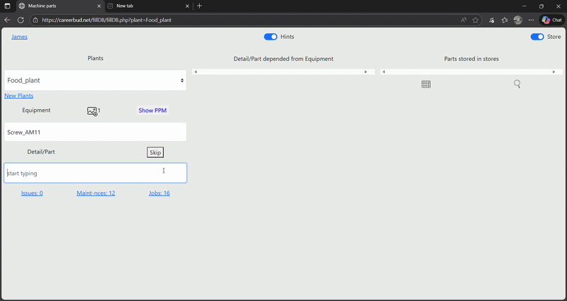
What started as an internal plant-management system evolved into a
flexible platform that now serves everyone in the organization —
from engineers on the shop floor tracking issues and PPMs, to
plant managers monitoring costs and efficiency, all the way up to
owners who need a clear view of asset value, investments, and
financial performance over time. And with its dedicated personal
mode, CareerBud adapts just as easily to individual projects,
hobbies, or small business workflows.
Designed to be implemented, not prescribed.
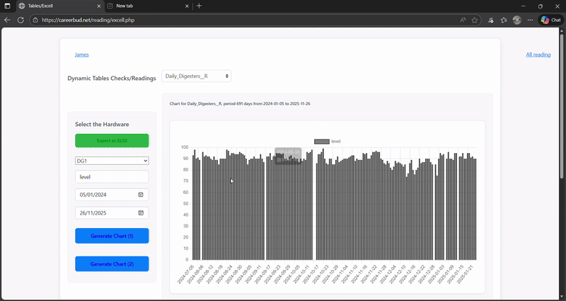
Administrators can align CareerBud with almost any plant model:
asset and field hierarchy, categories, readings and tables,
inventory behaviour, reporting views and operational emphasis — so
one subscription stays relevant as requirements evolve.
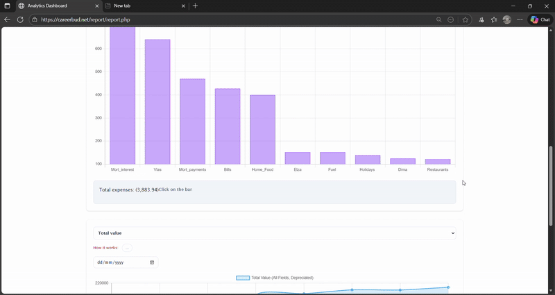
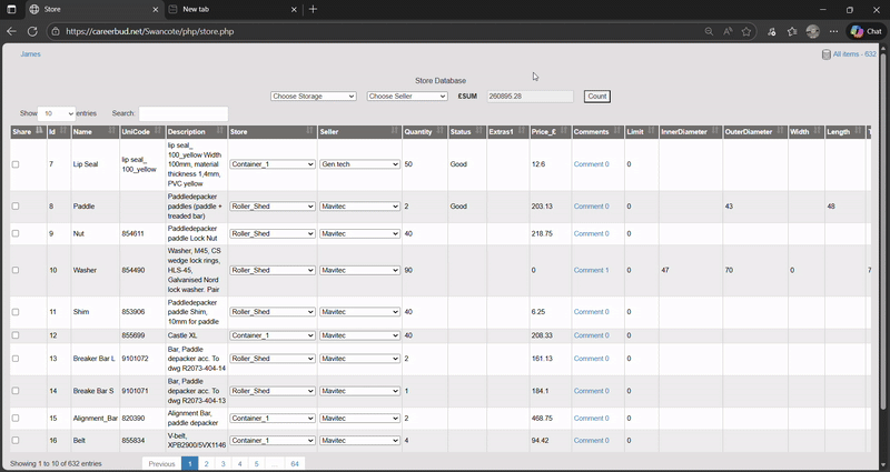
A single monthly subscription unlocks the full CareerBud.net
ecosystem including complete asset lifecycle management (initial
value, depreciation, adjustments, current worth, and final
financial results), task and shift planning, automated inventory
debits, efficiency analytics, preventive maintenance workflows,
and a dedicated personal productivity mode — all in one unified
platform.
Built by engineers in partnership with management. Proven in
production. Adaptable to any field — from industrial plants to
personal projects. CareerBud.net delivers structured data, clear
accountability, and actionable insight — so you can understand not
just what is being done, but whether it is worth doing.